

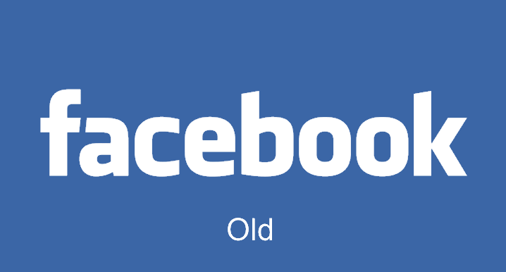
For the first time since 2005, Facebook quietly changed their logo and you probably didn’t even notice.
The change in their logo is only a refresh of the company’s wordmark, which is the text-only version of their logo used for identifying the brand.
Josh Higgins, Facebook’s Creative Director told Brand New that the company “set out to modernize the logo to make it feel more friendly and approachable” and settled on an update instead of a full redesign.
Facebook asked Eric Olson, the designer of Klavika, the font used for the original wordmark, to design a new typeface.
Ben Barry, a former designer at Facebook, had also proposed tweaks to the Facebook wordmark in 2012 which were approved by the company but never implemented.
Actually, the actual Facebook ‘F’ logo isn’t being changed. You’ll only notice the difference where the full name is used.
What do you think about this quiet change? Let us know in the comments section below.