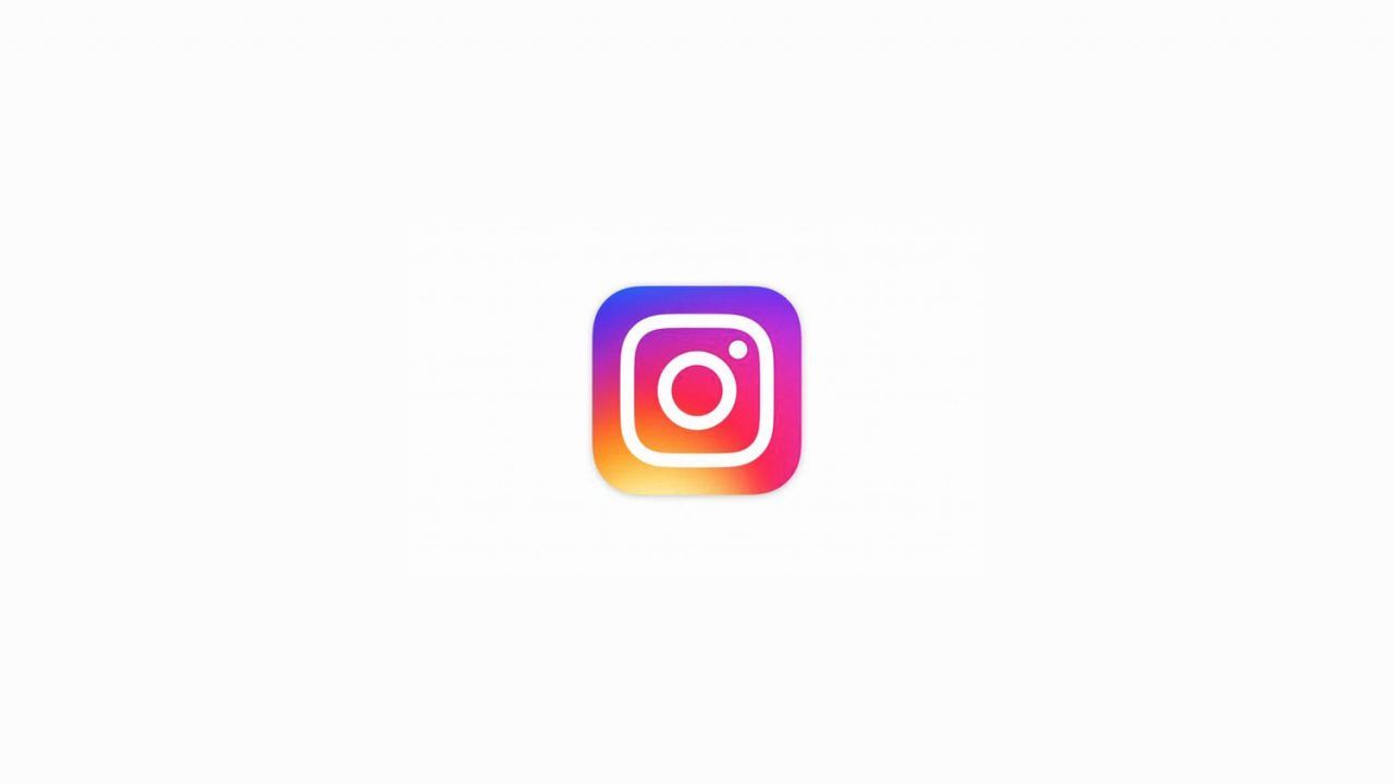
Instagram and its family of apps have gotten a new icon refresh. They replace the old vintage-looking square that we all got used to to a bright, colorful and a design that follows the usual flat design that is popular right now. Here it is:
The same look applies to its editing apps: Hyperlapse, Boomerang and layout to make it more similar.
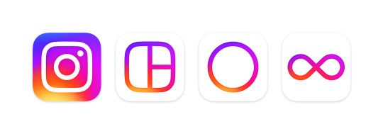
The previous logo was a retro-looking camera and it was one of the most recognizable tech logos in the market. Now, it has been replaced by a background gradient of sunset-looking colors (orange, yellow, pink and purple) with a more rounded camera logo.
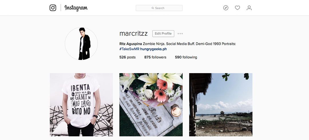
But there has also been a major redesign of the UI inside the app and its web version, and it is the total opposite. Black and white. They changed the color of white instead of blue and the icons are now black. The company stated that it’s designed to make the layout more simple so you can focus primarily on the images being shared. The rainbow-themed icons are supposed to represent Instagram’s diverse community, which it says brings all sorts of life and color to the platform.
Personally, the changes reminds us of stock Apple apps, and I loved it. How about you? Let us know in the comments section below.